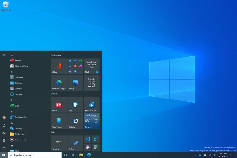
Microsoft has released the latest beta of Windows 10 and it includes a major change to the Start menu.
The Start menu is one of the most recognized features of Windows, so any change to it is sure to gain attention. The latest changes involves theme-aware tiles.
“We are freshening up the Start menu with a more streamlined design that removes the solid color backplates behind the logos in the apps list and applies a uniform, partially transparent background to the tiles,” writes Brandon LeBlanc / Senior Program Manager, Windows Insider Program. “This design creates a beautiful stage for your apps, especially the Fluent Design icons for Office and Microsoft Edge, as well as the redesigned icons for built-in apps like Calculator, Mail, and Calendar that we started rolling out earlier this year.”
LeBlanc says the new menu looks good in either light or dark theme, and even has accent colors for the dark theme.
This is a nice update to one of Windows’ most icon features, and will likely be a welcome change for many users.

